Topics
Levels and Curves
Levels and Curves tools are used to make adjustments to brightness, contrast and colour in an image (in this tutorial the focus will be on brightness and contrast). Although they do a similar job their methods are different. Almost any picture taken from a digital camera can be improved with these tools:
Topics covered:
- The Histogram
- The Pointer Panel
- Levels
- Adjusting with the Sliders
- Auto Levels
- Setting the Black and White Points with the Eyedropper Tool
- Curves
- The Adjustment Curve
- The "S" Curve
The Histogram
 Both the Levels and Curves panels display a histogram which indicate the dark, middle and light pixel values of an image. There is also an independent Histogram box that displays the same information (WINDOWs->DOCKABLE DIALOGS-> HISTORGRAM).
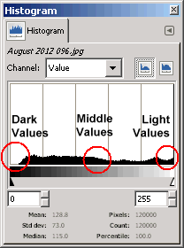
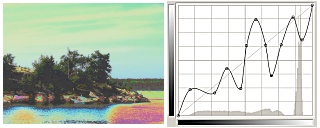
Every image has a Histogram and its job is to indicate the spread of Dark, Middle and Light values of the pixel that reside in the image. As shown here all the pixels are represented on graph by the black shading at the bottom of the graph. The extreme left of the graph represents pure black, the extremes right represents pure white and the exact middle represent the middle gray value. Therefore all the pixel values in the image are mapped on this graph from black to white. The height of the black bars indicates the number of pixels at the level. By default the Histogram's Channel is set to Value which displays the dark, middle and light values in the image. However each RGB channel can also be displayed separately and adjustments made directly to that colour.
The Histogram box currently indicates that the black, gray and white values are spread fairly evenly from end to end, indicating that the picture has good contrast and good middle detail. If the majority of pixels in the histogram were aligned more to the left that would indicate that the picture is dark. Conversely, if the majority of pixels align were aligned towards the right that would indicate that the picture is light. If the majority of pixels were aligned to the middle, that would indicate that the contrast is low in the image and would appear "flat".
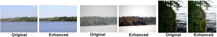
Three images are shown below with their respective Histograms. Examining the Histograms in relationship to the images and it won't take long for you to see the relationship between image and Histogram.
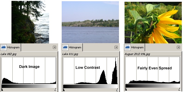
In the first image most of the pixels fall either in the dark end or the light end creating too much contrast and very little middle range and little detail. In the second image most of the pixels reside towards the right side indicating a lighter image and little contrast producing a "flat" image (lots of middle range but little contrast). The last image has a better spread of pixels between the dark to light indicating sufficient contrast and good mid-range detail.
The Pointer Panel
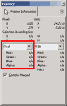
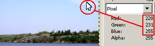 The Pointer panel is a useful panel to have on screen to display the RGB value of pixels that you move over (WINDOWS-> DOCKABLE DILALOGS-> POINTER). Any tool that moves over an image will display the RGB values of those pixels. The panel also displays positioning and RGB percentages but the actual RGB values will be the most useful. It is important when adjusting contrast and brightness to move over the lightness areas in the image to make sure those RGB values don't approach pure white or pure black. Any area in the image that is close pure black or white will have no detail in those areas. The RGB value of Pure White is 255 for each colour and the RGB value for Pure Black is 0 for each colour.
Any area that's close to pure white will contain very little detail and will appear flat. Its the same with black, the closer all the RGB values are to 0 the less visible detail there will be in that area and that area will also appear flat. For example, some people think that clouds are always white and if they are pure white in the picture then there adjusted properly. However, clouds are never white, there is always some colour, grays or off whites in them that hold the detail. Cloud detail can be subtle but its there. When clouds are pure white in the image they have lost what little detail they had and become nothing more that flat white spots on the picture.
Therefore, before and after adjustments are made to brightness and contrast in an image, you want to move around the image and examine the light and dark area to ensure that there are no large areas of pure white or black. Sometimes those areas are unavoidable because the picture was either underexposed or overexposed. In those cases its good to know in advance where the trouble areas are so you can watch those areas closely as you do your adjustments.
Levels
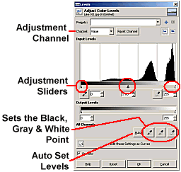 The Levels panel is found under the Color Menu (COLOR-> LEVELS) or the right click menu COLOR-> LEVELS. The Levels panel can adjust contrast, middle gray values and colour. By default it is set for the gray values but its options include adjusting the Red, Green, and Blue channels also.
The main components are:
Channels: by default it is set to value which indicates that all colours are adjusted by the Levels. However from the drop down arrow you can choose to adjust just the Red, Blue or Green channels.
Adjustment Sliders: there are three sliders; the Black Point slider, the Middle Gray (Gamma) slider and the White Point slider. Dragging those sliders shifts the those values of the pixels lighter or darker depending on which slider is dragged.
Black, Middle, White Point Eyedroppers: allows you to set the Black, Middle or White Point for the histogram by directly clicking on the image.
Auto Set Button: does the Levels adjustment automatically.
The Adjustment Sliders
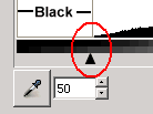 The Adjustment sliders are the main adjustment tools. What they do is shift a range of pixels values into a different set of values. As shown here the Black Point slider has been moved to position 50. That means that all pixels that lie within the value range of 0-50 will be darkened towards pure black. Pure Black is 0 and pure White is 255. If you drag the White Point slider to the right you will lighten the lightest values towards pure White. The Middle Slider can be dragged in either direction; left will lighten the pixels in that range and dragging to the right will darken those pixels in the range. Dragging the Black or White slider automatically moves the Middle slider in the same direction to compensate.
Therefore before adjusting for contrast and brightness move over the image, particularly over the lightest and darkest areas to see what the RGB values are and how much room there is to make adjustments.
Reset Button
Any time the adjustments get out of control, or you just want play around with them, you can set everything back to the default by clicking the Reset button or the Reset Channel button (if you were playing with the RGB channels).
Adjusting with the Sliders
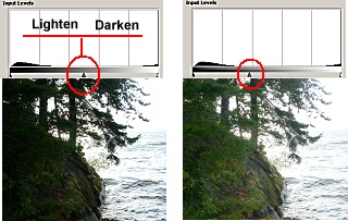
A well balanced image will have an even spread of pixels that extend from the Black Point slider to the White Point slider. When the pixels don't extend close to the either of the end sliders that generally means the image doesn't have enough contrast. To compensate either the Black Point slider or White Point slider or both are moved to the position where the pixels begin on the histogram. This shifts the Black Point/White Point and the middle values in the image.
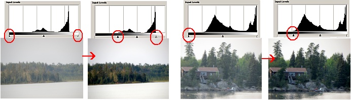
1) In the first image the Levels histogram show that no pixels extend to the Black Point slider or White Point slider. This indicate that there is very little contrast in the image as shown.
2) To compensate the Black Point slider is moved to the right until it touched the edge of where the pixels begin on the histogram. The White Point slider is moved to the right to the point where where pixels begin on the histogram. The result is that much of the mid tones pixels have been shifted darker or lighter resulting in greater contrast.
3) To increase the contrast in the second set of images only the Black Point slider needed to be moved, as indicated by the histogram.
 Sometimes an image has too much contrast and not enough pixels in the middle range. The Gray Point slider (Gamma) can be moved either left or right to compensate. Moving it to the left will lighten the middle range and moving it to the right will darken the middle range. In this example the Gray Point slider was moved to the left to lighten the middle range and bring back some of detail in the foliage. However, brightening up the middle range also brightened up the pixels in the sky resulting in a "washed out" flat area.
One way to avoid the light pixels in the sky being "washed out" is to select only the part of the image to be enhanced with the selection tools. The selection tools could have been used to isolate the foliage area only and then the Levels adjustment applied to it which wouldn't have effected the sky area at all.
![]() To compare the original image to the adjusted image Check and Uncheck the Preview box. This is a good habit to get into especially with very subtle adjustments.
To compare the original image to the adjusted image Check and Uncheck the Preview box. This is a good habit to get into especially with very subtle adjustments.
Auto Levels
![]() If you are not a fan of manual adjusting the sliders there is an Auto option that will do the work for you. Because the Auto button also shift colours, sometimes it works perfectly and sometimes it does a terrible job because the colours get shifted out of range. However its always worth a try if want to save some time, if it doesn't work out you always UNDO that action (CTRL + Z, or Undo through the the History Panel).
If you are not a fan of manual adjusting the sliders there is an Auto option that will do the work for you. Because the Auto button also shift colours, sometimes it works perfectly and sometimes it does a terrible job because the colours get shifted out of range. However its always worth a try if want to save some time, if it doesn't work out you always UNDO that action (CTRL + Z, or Undo through the the History Panel).
Below is an example of manual and Auto Levels adjustments. Notice that the Auto Levels has also adjusted the colours too. It does this by examining for a colour cast, which in this case is blue and compensates for the blue. Sometimes that works well and other times it doesn't.
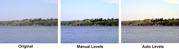
As discussed in the Layers page, you never work on the original base layer you always work on its duplicate layer. The big advantage to this is that you can use the layers's Opacity levels to blend the colours between the two layers together. For example, if the Auto Levels does a reasonable job but adds too much colour or contrast, then the opacity for that layer can be dialled down allowing the base layer to show through. The combination of both layers may produce a better image. You can also try applying Overlay Mode if you need to ass a bit more brightness and contrast.
Another tool similar to the Auto Levels button is the Auto White Balance command found under the Color Menu (COLOR->AUTO-> WHITE BALANCE). It does the same job as the Auto Levels but doesn't require the Levels Panel to be opened.
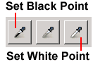
Setting the Black and White Points with the Eyedropper Tool
Rather than dragging sliders manually to set the Black/White Points you can use the Eyedropper tools to select a pixel in the image that represents the Black and/or White Point and that in turn will shift the values in the image. In other words the if the image doesn't have very deep blacks you select a pixel that should be deep black and that pixel will set close to Pure Black shifting all the dark values with it. Therefore before you start its important to identify the darkest and lightest areas in the picture.
There are two methods to help determine the darkest and lightest area in the image:
- Zoom in to the image and use one of the tools to move into the darkest and lightest areas of the image while watching the RGB numbers in the Pointer panel.
- Use the Threshold Panel to determine the darkest and lightest areas.
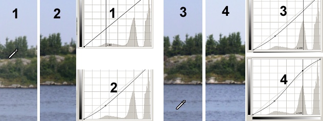
Finding the Darkest/Lightest Pixels with the Threshold Panel
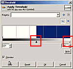 The Threshold panel changes all colours in the image to Pure Black or White based on its light/dark value. It has slider bars that allow you to increase or decrease the threshold range meaning that it can be used to find the darkest/lightest areas in the image.
Make sure that the Threshold is applied to a copied layer not the original Base layer as you will be deleting the copied layer. To find the darkest pixels you would drag the Black slider to the left until only a few spots remain. These will be the darkest pixels in the image. To determine the lightest pixels you would drag White slider to the left also until the first dark spots appear and those will represent the lightest pixel values. The darkest/lightest pixels need to marked on the Threshold layer so they can be found on the actual image layer. The Ruler Guides will do the job adequately. (To drag a Ruler Guide onto the image just place the pointer anywhere on the ruler and holding the mouse button down, drag a Guide out. Its best to use the Move tool as this tool will allow you to reposition the Guide. To remove the Guides, just drag them off the image with the Move tool and they will disappear).
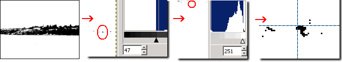
1) Threshold applied to the image
2)
Black slider is moved towards the left until only a few black spots remain. These are the darkest pixels.
3)
Leave the Black slider where it is.
4) White slider is moved towards the left until the first black spots appear, these will be the lightest pixels in the image.
5) Zoom into the images to locate the dark spots that represent the darkest pixels.
6) Drag a Horizontal and Vertical Ruler Guide so their junction marks one of the black spots.
7) Scroll to the area where the spots represent the lightest pixels and mark that area with a horizontal and vertical Ruler Guide.
8) Delete the copied threshold layer as it is no longer needed.
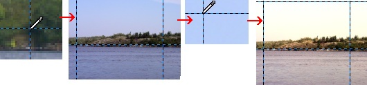
Setting the Black/White Point in the Image
 Once the Darkest and Lightest pixels have been identified it is just a matter of clicking on them with the Black/White Point eyedropper tools. Again its best to stay zoomed in so that you can select the actual pixels at the junction of the Guides. If you make a mistake click the Reset button and try again.
You may not always be setting both points in an image, depending on the amount light/dark areas in the image you may only need to set one of them. If need be you can still use the Levels Sliders for finer adjustments. Remember that if the image goes to bright or dark you can always set the Opacity lower for that layer so that both layers work together.
Setting the Gray Point
The Gray Point (Gamma) eyedropper is the one between the Black/White Point eyedropper. It functions to compensate for a colour cast in an image by neutralizing the gray area. Because a colour cast affects the whole image including the gray areas, the Gray Point dropper examines the RGB values in the gray area and shifts the RGB colours so they are closer together. If the RGB values are identical then the colour produced is gray. By examining the RGB values it knows how much Red, Green or Blue needs to added/removed to create the neutral gray. This of, course, affects the whole image as all the colours will be shifted to a certain degree to compensate for the colour cast. However this works best if there are actually areas in the image that are suppose to be gray (clouds, rocks, wood, etc.).
You can still use the Gray Point dropper to neutralize a colour cast if you know what the dominant colour is and what colour you need to neutralize it. In the following image there is a blue colour cast which is typical of landscape images showing both water and sky. What will neutralize blue is its opposite colour which happens to be yellow.
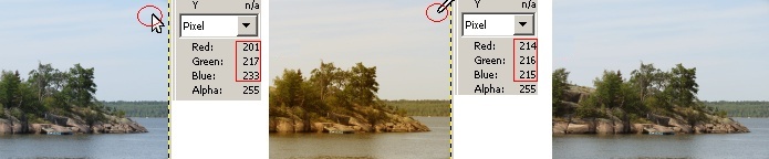
1) In the first mage the pointer is moving around the image trying to find something close to neutral. In this case it should be the clouds. The pointer Panel shows what the RGB values are that point in the clouds. They indicate a high level of blue with lower amounts of green and red.
2) The second image show that clicking on that same point with the Gray Point Eyedropper brings all three colours together; green is the reference colour as its number is between the red and blue. Therefore red is increased to match the green number and blue is reduced to match the green number. The result produces a gray value at that point but increases the red and reduces the blue throughout the rest of the image. This gives the image a yellow cast and yellow is opposite to blue.
3) The last image shows the final result which includes dialling down the opacity low for that layer to reduce the yellow caste but still provide some yellow to help neutralize the blue. To increase the brightness, contrast and colour use the Overlay Mode.
Curves
 The Curves Panel also adjusts the tonal values of light and dark, similar to Levels but it can also do it on a smaller and more selective scale. Because of this it tends to be seen as a more advanced tonal correction tool than Levels. Whereas Levels is seen as a broad value correction tool, Curves does both, broad and subtle corrections. Like Levels, it can also adjust each colour channel separately.
The Curves Panel displays the same histogram that Levels Panel does. However instead of getting both Black and White Point sliders at the bottom of the histogram, only the Black Point appears at the bottom, represented as an Anchor Point. The White Point Anchor Point appear at the top right of the histogram as shown. However both sliders behave the same, dragging the black point to the right increases darkness and dragging the white point to the left increase the lightness. The real difference between Levels and Curves is in that diagonal line that runs from the Black slider to the White slider.
As with the Levels always work on the duplicate layer. Remember if the corrections are too strong the opacity for that duplicated layer can be dialled down so that both layers contribute to the image. Also try the Overlay Mode to brightened the image and add a bit more contrast.
Use the Preview to view the before and after adjustments and use the Reset button if the adjustments look like there going way off the mark.
Basic Tonal Corrections
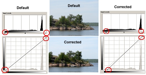 Basic tonal corrections are done in the same manner on both Panels as shown here. The Default image on top is the image with no corrections. The Corrected image on the bottom has been adjusted for contrast and brightness. The Levels and Curves histogram for both images as shown. The Default histograms are shown on the left and the Corrected histograms are shown on the right. Notice that Default histograms show the identical information indicating that both the Black and White Points need to be moved towards the pixels.
The Corrected histograms show that the Black and White Point sliders for both panels have been moved in exactly the same amounts resulting in exactly the same tonal corrections. Therefore for basic tonal corrections either the Levels or Curve panels will do.
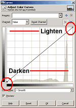
The Adjustment Curve
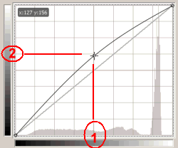 The main difference between Levels and Curves is that diagonal line running between the Black and White Point sliders. By default its a straight line indicating no corrections, but when you click on it an Anchor Point is added to the line and dragging the Point curves the line. In this example the point is added right in the middle of the line and dragged upwards creating a Curved line. Notice that the default straight line is still represented. By comparing the arc of the Curve to the default line you get an idea of the strength and the range of the tonal corrections that were applied to the image. In this example the Curve arcs higher in the middle range and less at the ends meaning that more of the middle values will be effected and less at the dark and light end.
Therefore, unlike the Levels sliders, that push a broad range of values one way or another, the Curves provides a graduated shift in the tonal range; more where the point was added and grabbed and less at the ends where the arc flattens out.
The Grayscale Bars
To understand which gray levels are being effected you need to look at both the vertical and horizontal grayscale bars. The horizontal grayscale bar represents the image, just like it does in the Levels panel. The vertical grayscale bar represents the destination values, meaning the change from the original values.
If you draw a vertical line downward from the point where the Curve was grabbed to the grayscale bar, as shown in Circle 1, those are the values that are being modified the most. In other words because the line was grabbed right in the middle, its the middle range that's being effected the most and as the arc flattens out the tonal change becomes more subtle.
Whether the tonal range Curve darkens or lightens depends on the vertical destination slider. If you draw a horizontal line from the point where the curve was grabbed to the vertical destination bar as show in Circle 2 you will notice that this does not end in the middle of the grayscale bar but is higher up into the lighter values. That means that the middle tonal values of Circle 1 are being replaced with the lighter tonal values of Circle 2 (the destination values).
Here two examples where the Curve is pulled from the exact centre, in two different directions; two grids spaces upwards and two grids spaces downwards. The centre of the histogram is the middle gray levels. Notice the relationship between Circle 1 and Circle 2 in both images:
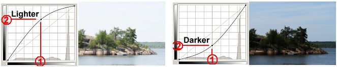
In the first image the Curve centre (middle gray) is moved upward two grid spaces which creates a high arc. The middle area is lined up across a much lighter gray area on the vertical destination bar. Therefore all pixels are shifted to the lighter values along the Curve but the curve exerts less influence as it flattens out near the ends. The second image is the opposite in that the middle gray range is moved downward and lines up with the darker values on the vertical destination bar, thereby darken everything on the Curve until it flattens out.
The "S" Curve
The "S" Curve is the signature curve for this tool. It takes its name from the long gentle slope of its "s" shape. Generally only two Points are inserted and moved; one for the Dark values and one for the Light values. This is similar to moving the Black and White sliders in the Levels except that the change is more gradual and you can place the points anywhere on the line not just at the ends.
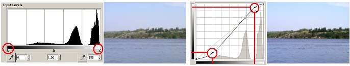
The illustration below shows an image before and after adjustments. The first photo is accompanied its Levels Panel and demonstrates that original image has very little black or dark values as indicated by the histogram. However it also shows that the lighter pixels go all the way to the White Point slider but the image is not very bright. If we drag the White Point slider to the right there is a risk that the very light pixels may brighten to much and fall into the Pure White area meaning that the highlights might get "blown out".
This is an example where Curves can handle this situation better as shown in the second photo. The second photo is corrected and shows that there is increase in contrast and brightness without any blown out areas. This is because anchor points can be created anywhere on the line and we are not forced to use the end points to make adjustments. To ensure the highlights don't get blown out, an anchor point is set before the White Point, that the brightness can be increased but the very light values will not be effected as much. Its the same with the dark values, we want to increase the dark value for contrast but don't want to lose detail in the real dark areas therefore an anchor point is added past the Black Point.
Therefore Curves can provide more flexibility in position and handling the brightness and contrast but it can also turn improper adjustments into a disaster as shown next.
Adding Points to the Curve
 You can add as many points to the Curve and drag them in any direction and each point will effect a small portion of the image. Therefore its possible to get everything from subtle brightness and contrast adjustments to really weird colour changes as shown here. The more points placed on the Curve the more likely you will encounter problems controlling the colour tonal range. Its best to keep it simple and minimize the number of points added to the Curve. Remember that Curves is considered an advanced tonal and colour correcting tool so it will take a lot more practise to master it than the Levels Panel.
Adding Points Using the Image
Points can be added to the Curves by clicking on the image. This is a more direct way to adjust a specific range because you get to choose where in the picture you want the adjustment to have the greatest effect.
1) For greater definition of the trees the tree shadow will be darkened. When the Curves panel is open, moving onto the image will turn the cursor into the Eyedropper tool. The Eyedropper is placed where the darkest shadow appears to be. Clicking with the Eyedropper places a vertical line on the histogram indicating where that dark value is on the histogram.
2) Clicking at that intersection adds an anchor point and the point is dragged downward to to darken those values in that range.
3) Because Curves gives us flexibility, we can choose which area to lighten and decide that the water should be a little lighter. The Eyedropper is placed into the water in an area that should be lighter. Clicking with the Eyedropper places a vertical line on the histogram indicating where that value is on the histogram.
4) Clicking at that intersection adds an anchor point and that point is dragged upward to increase the brightness in that range. Notice the signature "S" Curve.
By controlling which parts of the image to adjust you can adjust for a smaller range and you can do a better job in retaining detail in specific areas with less fear of blowing out other areas or making them go to dark.
Conclusion
Rarely will a digital image from you camera be so perfect that it doesn't need some type of enhancement. Often its hard to tell when looking at the image on the screen if it needs some work. A quick way to tell is to apply the Auto Levels or Auto White Balance to see if there is an improvement. Or duplicate the layer and apply the Overlay or Screen mode. Almost every time you try this you will notice an improvement particularly with colour casts that are common with digital cameras. Remember to apply the adjustments to the duplicate layer and if the adjustments are too dark/light or too bright the layer's opacity can be dialled down. It's always worth trying the Overlay or Screen modes also to see if they can punch up the image.
Comments or suggestions: lincpark@hotmail.com.