Topics
Creative Text Effects
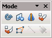
Both Draw and Impress have some interesting special effects tools that can take text and text shape objects to another level. Some of these "Special Effects" tools are found on the Mode toolbar (VIEW-> TOOLBARS-> MODE). Some of the tools will require a bit of trial and error when experimenting with them while others are more straight forward.
The tools/commands discussed here include:
- Fontwork (mostly as comparison to the other tools)
- Set In Circle (Perspective)
- Set To Circle (Slant)
- Distort
- Duplicate Command
- Cross-Fading
Fontwork
Most users of Draw or Impress are already familiar with Fontwork. This section will review the Circle Fontwork styles that most users are familiar with and add a few twists to it. This will set the stage for 2 very special effects commands; Set In Circle and Set To Circle.
Fontwork Circle Shapes

![]() Of all the Fontwork styles, the Fontwork Circle shapes seems to give users the most trouble. The icons represent what they do but they may not be appear quite as obvious as they could be, particularly if a user has never worked in any other kind of graphic design program before. Even the tool tip that appears over the shape button is less than helpful.
Of all the Fontwork styles, the Fontwork Circle shapes seems to give users the most trouble. The icons represent what they do but they may not be appear quite as obvious as they could be, particularly if a user has never worked in any other kind of graphic design program before. Even the tool tip that appears over the shape button is less than helpful.
The Fontwork Circle shapes are divided into two categories with 2 subcategories:
- Circle Curve: Circle (curve) and Open Circle (curve)
- Circle Pour: Circle (pour) and Open Circle (pour)
Circle (curve)
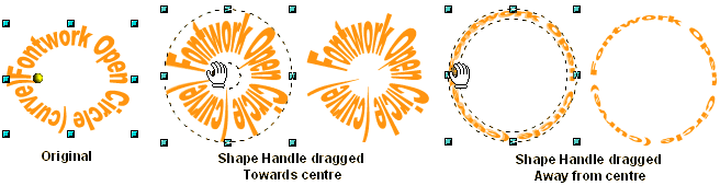
![]() The Circle (curve) shapes text over a circular path. The text can go completely around the path or partially around the path. The text flows around the path in an East/West direction. The size of the text is controlled by how much it completes the circular path. The less complete the circular path the smaller the text will be. Also, the more text typed the smaller it will get. To get a real circular shape rather than an elliptical shape the Fontwork object needs to be stretched vertically. Moving the Shape Handle past either left or right sizing handle will flip the text, which is particularly useful if only needing to use half of the path.
The Circle (curve) shapes text over a circular path. The text can go completely around the path or partially around the path. The text flows around the path in an East/West direction. The size of the text is controlled by how much it completes the circular path. The less complete the circular path the smaller the text will be. Also, the more text typed the smaller it will get. To get a real circular shape rather than an elliptical shape the Fontwork object needs to be stretched vertically. Moving the Shape Handle past either left or right sizing handle will flip the text, which is particularly useful if only needing to use half of the path.
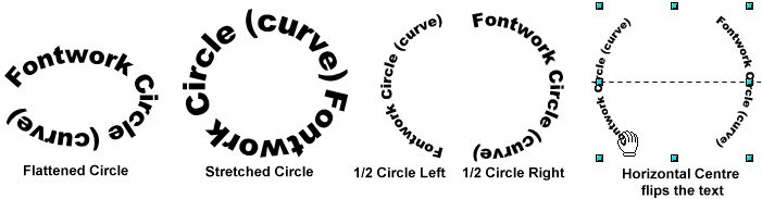
 There is no direct way to control how the text flows along the circular path as it flows equally left or right with the centre point being over either the left or right sizing handle. If only creating a half circle of text, the text will flow either on the left or right half of the circle not the top or bottom. If you want the text to only flow on the top or bottom half of the circular path then you need to rotate it into that position. If you try to use the Flip command to flip the text to the opposite side of the arc, it will not work the way expected as the text will flip backwards similar to a mirror image.
 Although Circle (curve) shape is meant for a continuous string of words, you can create "word arches" where the words arch over each other because they are on separate lines. To create word arches you need to use the Enter key to insert paragraph breaks between the words you wish to place on separate lines. By placing the words on separate lines you get a series of row arches created by the words. The more Enters (paragraph space) you place between the words the greater the vertical space between the words.
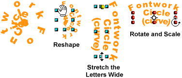 However, you will still need to do some minor manipulating of the shape to get some of the words readable as the inner arched words will jumble their letters together as the angle of the arch gets smaller and smaller. Generally all that is required is to reshape the Fontwork object using the Shape Handle, keeping in mind that more you travel around the circular path, the larger the letters get. The next step is to stretch the words wider (not taller) by stretching the side Shape Handles until all text is readable (it will get very large). The final step is to resize the shape back to the original size by holding down SHIFT button (to constrain the Proportions) and dragging any of the sizing handles until it returns to the desired size. If need be, use the Rotate tool to rotate the Fontwork to the desired position (hold down the SHIFT key to constrain rotation to 15 degree increments or use the Position and Size box).
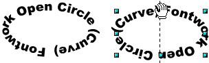
Open Circle (curve)
![]()
The Shape Handle flips the text when passing over the Top or Bottom sizing handle.
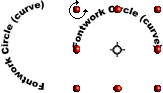
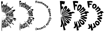
The Open Circle (curve) is designed for multiple word Fontwork objects. At the basic level it behaves similar to the Circle (curve) command, in that words can flow completely around the path. The text flows in a North/South direction. The path always starts from the top centre and moves equally down both sides towards the bottom. When the Shape Handle passes over the Top or Bottom sizing handle then the words will flip. You can not directly create a left, right or bottom half circle of text but you can Rotate the text into that position.
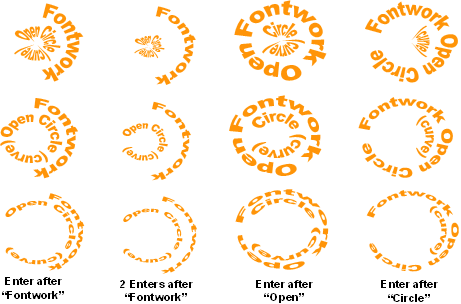
The real purpose of the Open Circle (curve) is to stretch a word or line of text across the middle of the circle path as indicated by its icon. Once again paragraph breaks (Enter key) are used to place words on separate lines. If only one paragraph break is used, the word or words following the paragraph space will be placed in the middle and stretched across in a straight line. The Shape Handle will spread the word or words preceding the paragraph break around the top and bottom of the circle. Multiple paragraph breaks create multiple variations.
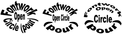
The illustration below demonstrates the variation with one paragraph break placed after the word "Fontwork". Generally you will need to use the Shape Handle to redraw the shape to make it more readable.
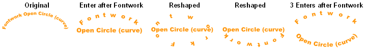 Enter placed after the word Fontwork: Variations of the shape after one paragraph break. Inserting more paragraph breaks separates the the text creating more space. An image or another word can be placed inside creating a "logo" effect.
![]() Where you place the paragraph break, in front of or behind a word can make a difference on how the shape behaves. Placing a paragraph break before and after the first word "Fontwork" places the word Fontwork in the middle of the circular path and therefore on the straight line.
Where you place the paragraph break, in front of or behind a word can make a difference on how the shape behaves. Placing a paragraph break before and after the first word "Fontwork" places the word Fontwork in the middle of the circular path and therefore on the straight line.
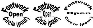
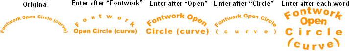 Enter placed after each word: Paragraph breaks placed after each word except the last word "(curve)". Each shape is adjusted with the Shape Handles to make the text more readable.
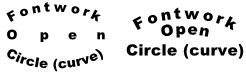 As mentioned above inserting a paragraph break before the first word places the first word in the centre text and stretches it across the centre circle shape. Placing a paragraph break after the last word can also produce interesting results. In this illustration both Fontwork objects have a paragraph space after the words "Fontwork" and "Open". The second Fontwork object has an extra paragraph break after the last word "(curve)". This empty paragraph break makes the words "Circle (curve)" the centre of the circular shape and therefore straightens and stretches them while maintaining a curve arch for both the words "Fontwork" and "Open".
Circle (pour)
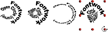
![]() The word "pour" in Circle (pour) means that the letters can be foreshortened (perspective like view) towards or away from the centre of the circle path. Moving the Shape Handle towards the centre, elongates the letters towards the centre and making them appear to be foreshortened into the centre. Moving the Shape Handle away from the centre, compressing the foreshortening making the letters appear to be receding away from the centre. The text flows in left/right direction. Passing over the horizontal centre flips the text. To pour as close into the centre as possible, you need to zoom in very close.
The word "pour" in Circle (pour) means that the letters can be foreshortened (perspective like view) towards or away from the centre of the circle path. Moving the Shape Handle towards the centre, elongates the letters towards the centre and making them appear to be foreshortened into the centre. Moving the Shape Handle away from the centre, compressing the foreshortening making the letters appear to be receding away from the centre. The text flows in left/right direction. Passing over the horizontal centre flips the text. To pour as close into the centre as possible, you need to zoom in very close.
 The Shape Handle greatly influences the "pouring" of the letters. Dragging the Shape Handle towards the centre of the circular path "pours" the letters into the centre, with a strong sense of foreshortening as the letters are skewed towards the centre. Moving the Shape Handle away from the centre compresses the text but still provides some foreshortening of the text with the sense that the text is receding away from the viewer.
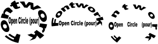
 The more the text is poured towards the centre more it needs to complete the circle to become readable. As demonstrated in this illustration, a half circle of test is best read when dragging the Shape Handle away from the centre. Also the more words use in the Fontwork object the more acute the foreshortening becomes as the Shape handle is dragged towards towards the centre.
Although this shape probably wasn't specifically meant for paragraph breaks, they will still alter the look of the Fontwork object. With the Circle (pour) object there is the extra option of pouring towards or away from the centre. However unlike the Circle (curve) object placing a paragraph break after the first word does not allow that word to continue around the circle. Placing a paragraph break after at least two words will allow those words to flow around the circle shape. Also keep in mind, since this shape is a left/right flowing shape, you may need to Rotate it for a top/bottom flow.
In this illustration the four columns demonstrates how the Fontwork object becomes modified by placing paragraph breaks after different words. The "Enter" of course represents a paragraph break.
The Fontwork objects in the middle row represents a mid-range where the text is not skewed very much and the text is still very readable.
In the top row the Fontwork object's Shape Handles were dragged as close as possible towards the centre for an extreme foreshortening (pouring) towards the centre. For fine incremental adjustments it does help to zoom in closely on the object when dragging the Shape Handle. If you don't zoom in close you may end up flipping the text rather than pouring towards the centre.
In the bottom row the Fontwork object's Shape Handles were dragged away from the centre for an extreme compressing of the text.
Open Circle (pour)
![]()
 Like the Open Circle (curve), the Open Circle (pour) is meant to receive paragraph breaks to place words in the middle of the circular shape. In this illustration the paragraph break is placed after the word "Fontwork" which forces the words "Open Circle (pour)" to be placed in a straight line in the centre while allowing the word "Fontwork" to flow around them. The flow is a north/south direction. Extra space can be added between letters or words if more spacing is needed. There is an inverse relation between the number of words used for the straight centre, and how pronounced the foreshortened pouring effect will be.
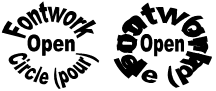
In this illustration there is a paragraph break after the word "Fontwork" (which forces the word "Open" on its own line) and a paragraph break after the word "Open" (which forces the words "Circle (pour)" back out into the circle). However unlike the other circle shapes notice that if more than one paragraph break is used the words can be made to accidentally overlap each other making them hard to read. Of all the Fontwork Circle shapes, this one probably requires the most control to be effective.
 Multiple paragraph breaks and shape adjustment produce interesting results.
 As with the Circle (pour) dragging the shape Handle towards or away from the centre modifies the foreshortening "pouring" effect considerably. Once again if you wish to pour into the centre as close as possible, it will be necessary to zoom in close.
Set in Circle (perspective)
![]()
 Set in Circle (perspective) is one of the object transforming tools found in the Mode toolbar. The Mode toolbar contains most of the special effect tools for transforming objects. This tool works only on vector objects not bitmap objects. All vector objects including text, Drawing shapes and Fontwork, must to be converted to a "Curve object". (Most of the tools in the Mode toolbar will ask you if you wish to convert the object to a curve if its not already a curve object.) This tool reshapes objects in a similar way that the Fontwork shape handle reshapes text. All vector shapes including all the Drawing Shapes can be distorted, bend and reshaped.
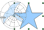
![]() When the Set in Circle (perspective) tool is selected the pointer will change to the "Set in Circle" icon when placed over any selection handle. As soon as the selection handle is manipulated a perspective grid becomes visible over the object. As you bend, twist and distort the object the grid also bend, twists and distorts with the object so its easy to see how and why the object is being transformed into the shape it becomes. The object can be manipulated to such an extent that in no longer resembles its original shape.
When the Set in Circle (perspective) tool is selected the pointer will change to the "Set in Circle" icon when placed over any selection handle. As soon as the selection handle is manipulated a perspective grid becomes visible over the object. As you bend, twist and distort the object the grid also bend, twists and distorts with the object so its easy to see how and why the object is being transformed into the shape it becomes. The object can be manipulated to such an extent that in no longer resembles its original shape.
The circular grid can be seen to be made made up of circular "rings" with longer rings on the outside and shorter rings towards the centre. Any part of the shape that is on the outside rings will elongate or stretch wider while any part of the shape that is in the shorter rings will compress or squish together.
The Circle Grid
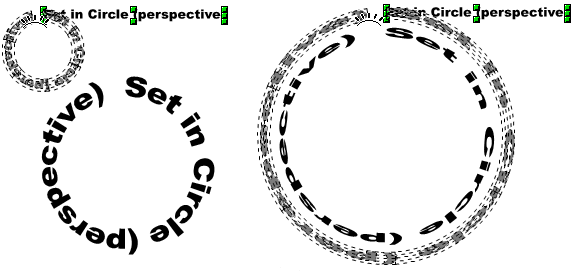
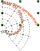
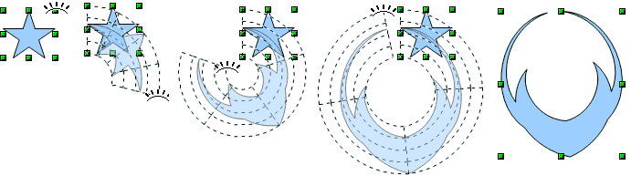 In this illustration a Drawing star shape has been converted to a curve and the Set in Circle icon is manipulating the top right selection handle. The basic concept is to drag that handle in circular pattern (hence the name Set in Circle) and bring it back to the opposite side of the shape as shown. Its not necessary to complete the circle, you can stop at any point. The grid shows the circular pattern and how it distorts the shape.
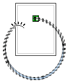
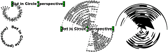
 This tool can easily get out of control as shown here in this zoomed out illustration of the Draw slide. Its very easy to make the grid jump really large and off the slide. Similar to the Fontwork shape handle, the object is easily flipped when passing over a certain point. The middle handles will effect the object differently than the corner handles. When dragging a handle, you generally drag in a circular motion. Its not necessary to drag out a complete circle, you can stop at any point and just drag out a part circle. For the best results it is necessary to zoom in close as that will provide more control over the tool. When zoomed in close the tool can even be made to overlap itself and create some interesting shapes.
Some tips on using this tool:
- Zoom in close for better control
- When dragging a handle, keep it close to the shape. The further you drag it away from the shape the less control there is and most likely the grid will jump very large.
- The SHIFT key can be used to slow down the drawing of the grid and it can help to constrain the size of the grid.
- It is not necessary to drag the grid into a complete circle.
- A shape can be manipulated over and over.
- Try dragging different handles, you will get different results.
- If you don't like what you get use the Undo command or the keyboard shortcut CRTL+Z.
- This is an excellent tool to manipulate text that has been converted to a Curve.
Manipulating a Text Shape
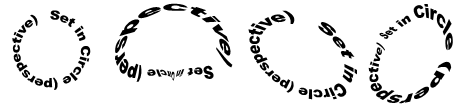
 As shown in this illustration, the larger you make the circle grid the more foreshortened (compressed) the letters become. To some extent, the circular shape of text resembles some of the Fontwork Circle shapes discussed above. It does make a difference which handle is used. The top and bottom middle handles will produce an entirely different effect than the other handles. The corner handles and the left and right middle handles always produce a circular effect as show here while the top and bottom middle handles will create a very different effect as shown below.
In the first example the right middle handle was dragged to create the circle text shape. The corner handles and the left/right middle handles create a narrow ring shaped circular grid.
In the second example the top middle handle was dragged which creates a large, flat circular grid. The text shapes stretch flatly along the circular grid creating a kind of spinning effect. This also creates large blocks of solid areas from the overlapping shapes, which renders the text unreadable.
Reworking the Grid
 One advantage of the Set in Circle (perspective) tool is that circular shape's grid can be manipulated over and over. The most interesting shapes will probably those whose grid has been manipulated at least twice. In this illustration the three circular shapes are manipulated once more using different handles. The results yield dynamic but still readable text shapes. Drop shadows, colour fills and even rotating the shape if necessary, will provide lots of "artistic punch" to the circular shape. However, manipulating the grid beyond 3-4 times often results in some distorted and unreadable text shapes.
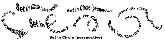
More examples demonstrating manipulation of the grid multiple times using different handles.
Keep in mind that when a shape's grid is being manipulated several times that the shape is already foreshortened and distorted and it is this foreshortening and distortion that you are manipulating. Its not as if the shape resets itself before the next distortion. In other words if the text has been stretched or distorted too much to be readable, there is no way to fix it as the distortion just gets worse. This where the Undo command comes in handy. If the shape isn't working out after the second or third manipulation cut your losses and use the Undo and try again.
 When manipulating the circle grid multiple times keep an eye on how the text shape winds around the "rings" of the grid. The larger outside rings will elongated the shape with the greatest elongation happening on the outside ring. Conversely, the smaller lower rings will compress the shape with the greatest compression of the shape taking place in the lowest ring of the grid. Using different handles and rotating in different direction effects the elongation and compression of the grid. If you find that the part of the shape in the lower rings of the grid are too compressed, you can try dragging a couple of the middle handles outward. Generally when the middle handles are dragged outwards they tend to stretch the shape and can sometimes stretch out a compressed area. However if the shape is too compressed this may not help and the only recourse is to use the Undo command to undo to a previous state and try again.
Keep this in mind:
- the smaller you make the lower rings the more compressed that part of the shape will become.
- The larger you make the outside rings, the more elongated that part of the shape will become.
Set to Circle (slant)
![]()
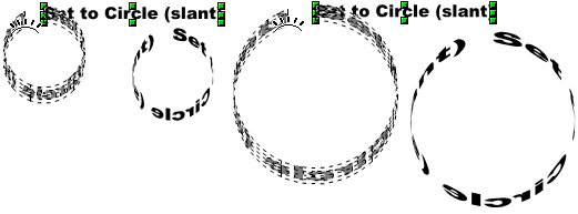
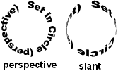 The Set to Circle (slant) command is also found in the Mode toolbar, but it works differently than the Set in Circle (perspective). The difference is in how the shape is distorted around the circle grid. This illustration compares both the Set in Circle (perspective) and Set to Circle (slant) shapes. Whereas the perspective shape flattens the letters as the circle is completed, the slant compresses or "slants" the letters at the widest angle. The slant effect looks like the text shape is wrapping around something.
In other words both the perspective and slant modes use the circle grid to compress a shape but the difference is in how the circle grid achieves this effect. Whereas the perspective grid creates a grid with larger outer rings and smaller lower rings that is used to compress the shape, the slant grid stays the same size and the compression happens to the edges of the grid that are at the greatest angle from your point of view.
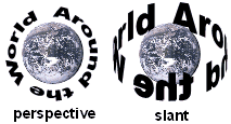 The difference between the two is better illustrated using the phrase "Around the World". In the perspective object the letter shapes are flattened out and circle the earth image in a North/South longitudinal direction as if circling around the poles. In the slant object the letters shapes rotate around the earth image in a latitudinal direction as if they are circling around the equator of the earth. As the letter shapes "bend" around the earth, where the bend is the greatest the letter shapes are compressed thin and have the visual appearance of circling the earth. Therefore the Set to Circle (slant) is best used when the effect of circling around the circumference of an object is desired.
Dragging a handle left or right produces a slightly different effect as to how the letter shapes rotate around the circle grid. Dragging to the left you tend see the bottom of the letter shapes. Dragging to the right you tend see the top of the letter shapes.
As shown here, the larger you make the circle grid the more slanted (skewed) the letter shapes become. To keep the letter shapes more readable, make a smaller circle and just enlarge it using the handles. Keep the SHIFT button down to constrain the proportions. You will probably find that enlarging smaller shapes works better than creating overly large shapes.
Reworking the Grid

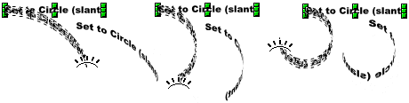 Reworking the Set to Circle (slant) grid will not yield the multitude of interesting results that the perspective mode did. The 2 main reason being that you have less control on the distortion and some aspect of the shape will always be severely compressed. However working the grid can yield some interesting, though not necessary totally readable results.
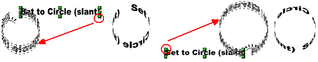
Wrapping the Shape Around an Image
 To create the appearance of the text shape wrapping around an image several steps are required:
- Ungroup the shape - all letter shapes can now be individually selected.
- Select the letter shapes that should appear behind the image and use the Send to Back command to sent those shapes behind the image as show in the "Re-worked" example.
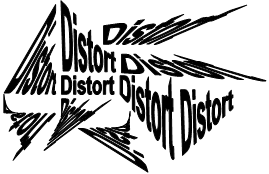
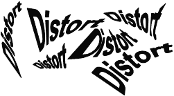
Distort
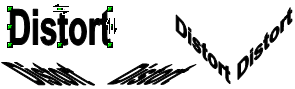
![]() The Distort command is also found in the Mode toolbar. It only works on vector objects that have been converted to curves and that includes Drawing shapes, text and FontWork objects. Bitmaps need to converted to Contours but the effect is very limited on bitmaps and mostly acts as mask that hides part of the skewed image. The Distort command has two modes
The Distort command is also found in the Mode toolbar. It only works on vector objects that have been converted to curves and that includes Drawing shapes, text and FontWork objects. Bitmaps need to converted to Contours but the effect is very limited on bitmaps and mostly acts as mask that hides part of the skewed image. The Distort command has two modes
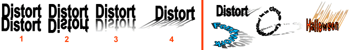
- Skew: is activated by selecting any of the middle handles. The Left and Right middle handles skew the object horizontally left or right and the Top and Bottom middle handles skew the object vertically up or down.
 Perspective: places a perspective grid on the object when any of the corner handles are selected. Dragging by any corner handle creates a one-point perspective distortion. Dragging the top left corner handle creates a one-point perspective receding away from the viewer. Dragging the top right corner handle creates a one-point perspective coming towards the viewer.
Skew
When placing the cursor over any of the middle handles the cursor will change to the "Skew" icon (double half arrows) and the arrows point in the direction to drag; horizontally for the Top and Bottom handles and vertically for the Left and Right handles. Objects can be skewed down to almost a flat line. The object can also be stretched with the skew handles, thereby allowing an object to be skewed and stretched at the same time.
 Probably one of the best uses for the Skew is in creating skewed drop shadows on objects. In this illustration 4 steps are shown in the creation of a skewed drop shadow. The right side of the illustration demonstrate how effective skewed drop shadows can be for adding depth to an object.
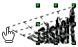
Perspective
 Placing the cursor over any of the corner handles turns the cursor into the "pointing hand" cursor and a one-point perspective grid is placed on the object. Dragging the handles clearly shows the grid and how the one-point perspective grid will effect the object. The handles can be dragged in any direction. Holding down the SHIFT key will constrain the grid to 45° angles. As shown in this illustration on the right, the one-point perspective can be taken to the extreme and can make some text shapes difficult to read.
Reworking the grid
 As with the other special effect tools that use a grid, the grid can be reworked by selecting another corner handle and moving in a different direction. Once again a grid will appear and the grid will indicate the perspective distortion that will be applied. You will probably find that reworking the grid will create better effects than just applying the one-point perspective grid once to the object (unless, of course, the simple one-point perspective is what you want). Combining the Skew and Perspective will also create interesting effects.
 Combining the Skew and Perspective effects can create a variety of interesting drop shadows for objects. You will probably find that this combination will create more realistic drop shadow effect than a simple Skew or one-point perspective shadow. These combination can create shadows that appear to climb up a wall as shown in the first example in this illustration.
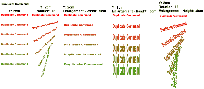
The Duplicate Command
The Duplicate command is found under the Edit menu: EDIT -> DUPLICATE. It's function is to duplicate objects, however you need set some of its options before you duplicate anything.
 At the basic level the Duplicate command is fast tool for creating multiple copies of an object. For example, if you wanted to create 11 straight lines exactly 2.5cm (1 inch) apart form each other, you would create the first line and then set those options in the command box, and as a result, you would get exactly 11 straight lines, each exactly 2.5cm apart. Or maybe you would like to create 11 stars, equal distant, going down the side of a page while blending their colours from red to blue; simply create the first star and set those options in the command box. In other words instead of copying and pasting an object multiple times, then changing their attributes and then aligning them up, the Duplicate Command can do some of that for you and save you lots of time in the process.
The Duplicate Command dialogue box
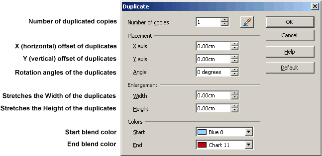
The options are broken down as such:
Number of copies: number of duplicate copies
- Placement:
- X axis: moves each duplicate horizontally left (negative value) or right (positive value). Each duplicate moves the "X value" amount away from each other.
- Y axis: moves each duplicate vertically up (negative value) or down (positive value). Each duplicate moves the "Y value" amount away from each other.
- Angle: rotates the duplicated objects. Each duplicate is rotated from the previous duplicate by the indicated amount.
- Enlargement:
- Width: stretches each duplicates' width (positive value) or compresses each duplicates' width (negative value).
- Height: stretches each duplicates' height (positive value) or compresses each duplicates' height (negative value).
- Angle: rotates each duplicated objects. Each duplicate is rotated from the previous duplicate by the indicated amount.
- Colors:
- Start blend color: applied to the original object which starts the colour blend between duplicated objects.
- End blend color: last duplicated object's colour that ends the colour blend.
Just about any object can be duplicated, including drawing shapes, Fontwork, custom shapes, text, text shapes and bitmaps. Some options may not be applicable to certain objects, i.e., the Colors options won't apply to duplicated .jpg images, but will apply to .gif and .png images that contain transparencies as the transparent part will be filled with the blend colours.
Some points to consider when using this command:
- An object being duplicated will have its original colour replaced by the Start blend color if the colours are not the same.
- When duplicating text boxes, the options only apply to the text box itself, not the text.
- Grouped objects will have their original colours replaced with the Start blend color.
- The Color options do not apply to non-transparent bitmap images like .jpg and .tif but will apply to bitmap images with transparences like .png and .gif (the transparent part of the images takes the colour).
- The effect of the Placement and Enlargement options are cumulative. For example, if the Width option setting is set to 2.5cm (1 inch), the first duplicated object's width will be stretched (increased) by 2.5cm which then becomes the starting width for the second duplicate, which in turn increases its width by another 2.5cm, which then becomes the starting width for the third duplicate which in turn increases its width by another 2.5cm and so forth.
- The duplicated objects are not Grouped together.
- Duplicated objects are duplicates of the original, meaning that if a FontWork object is duplicated all the duplicates are Fontwork objects also.
Examples of the Duplicate Command and with various options. Since this command effects a text box rather than the text, the text here was converted to curves so the that text shape could be effected. The original text shape was Black and the Start and End blend colours were Red and Green. If you don't wish to blend colours, make sure the Start and End colours are the same as the object's colour.
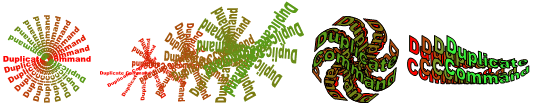 It is clear to see that using a combination of options will yield many interesting possibilities. Applying this command to Fontwork objects can also create some interesting designs.
Mixing up the options won't always yield useable results. Like any special effect tool its a matter of trial and error before you can reasonably anticipate what the results will be. As always, if the effect doesn't turn out the way you expect or like, then Undo the effect and try some other options.
Cross-fading
The Cross-fading command is found under the Edit menu: EDIT -> CROSS-FADING. It's function is to make incremental changes to the duplicate objects in a "twisted" way. This command requires two objects; a Start object and an End object which are usually set a little distance apart so that the duplicates can be created between them. Once completed, the command Groups all objects together.
At the basic level, if the Start and End objects are the same then the duplicates will be identical, which is similar to the Duplicate Command. For example, if two squares of the same size but different colours are used as the Start and End objects, the duplicates will all be the same size but their colours will be a blend between the Start colour and End colour. If, however, the End square is bigger, then each duplicated objects will increase in size until the last duplicate is almost the same size as the End square. Cross-faded objects are always grouped together once they are created. To use any of the in-between objects they will need to be ungrouped. Only vector shapes can be Cross-faded. Drawing shapes can be used as they are but Fontwork objects will need to be converted to curves to cross-fade properly. Text boxes won't cross-fade so text needs to be converted to curves to cross-fade. The real fun part happens when Cross-fading different shaped objects.
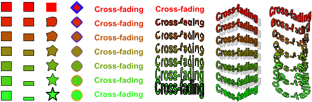
Cross-fading examples using Drawing Shapes, text shapes and Fontwork objects. Text and Fontwork objects need to be converted to curves.
The more different the Start and End objects are, the more distorted or twisted the Cross-fading objects become.
Although Cross-faded objects are automatically Grouped, Cross-fading will not work on Grouped objects. When converting text to curves keep in mind that the Convert to Curve command will also automatically Group the text shapes together. The text shapes will need to Ungrouped as individual objects and then either Merged or Combined into one object. The text shapes will still look the same but will no longer be a collection of individual grouped shapes. If you are ever trying to use the Cross-fading command on two objects and notice that the command is "grayed" out, meaning it can't be used, then its most likely that one or both of the objects are still grouped together.
Cross-fading Command dialogue box 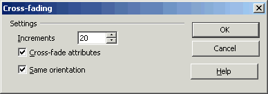
Cross-fading has only three properties:
Increments: the number of incremental changes (created objects) between the START and END objects.
Cross-fade attributes: blending the START and END attributes, such as colour and line, between all created objects. If left Unchecked then the START objects attributes are applied to all created objects.
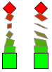 Same orientation: makes a smoother transition between the cross-faded objects by orienting them on the same plane. This can be seen in this illustration of a Cross-fading red diamond shape and green square. In the first example the Same orientation is selected and the cross-faded shapes are in the same flat plane as the START and END objects. In the second example the Same orientation is not selected and the flat plane of the cross-faded shapes appear to rotate towards/away from the viewer into their new shapes.
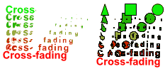 The Cross-fading effect matches which START and END shapes will cross-fade with each other starting from the left shape and working towards the right to the last shape. Where the START and END objects contain different number of shapes, the effect tries to simulate the cross-fading of the non-matching shapes. In this illustration the first example has a START shape using only the text shapes "cross" while the END shape uses the full text shape "cross-fading". In the second example a triangular, square and circular shape is cross-faded into the "cross-fading" text shape. Notice that in both cases the START object has less shapes then the END object. The Cross-fading effect simulates the non-existing shapes based on the distortion of the existing shapes. Notice that the triangle, square and circle shapes are cross-faded only into the first three letter shapes of "Cross-fading". Generally, if the START and END objects contain the same number of shapes then the cross-fade effect can better match shape to shape which will usually yield better results.
Creating Grungy Text
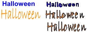
![]() Anyone who has used the Points button to access and manipulate the Control points of text shapes knows that you can create unique text shapes using this method. However it requires a lot of practise to understand how Control points effect line segments. An easier way to create unique, weird, jagged, rough or grungy looking text shape letters is to Cross-fade 2 text shape objects. For example, if creating a Halloween banner, cross-fading 2 "Halloween" text shape objects can quickly create some rough, grungy looking intermediate text shapes that help convey the spooky Halloween content. In this illustration two different fonts were used used for the START and END text objects (you can use the same font for both as long as one is different such as enlarged or stretched). Not all the cross-faded objects will be useable, but some of them will be very readable as shown here. The higher the Increment number, the more intermediate shapes are created which yields smaller changes between each shape which in turn creates a higher number of readable text shapes.
Anyone who has used the Points button to access and manipulate the Control points of text shapes knows that you can create unique text shapes using this method. However it requires a lot of practise to understand how Control points effect line segments. An easier way to create unique, weird, jagged, rough or grungy looking text shape letters is to Cross-fade 2 text shape objects. For example, if creating a Halloween banner, cross-fading 2 "Halloween" text shape objects can quickly create some rough, grungy looking intermediate text shapes that help convey the spooky Halloween content. In this illustration two different fonts were used used for the START and END text objects (you can use the same font for both as long as one is different such as enlarged or stretched). Not all the cross-faded objects will be useable, but some of them will be very readable as shown here. The higher the Increment number, the more intermediate shapes are created which yields smaller changes between each shape which in turn creates a higher number of readable text shapes.
Conclusion
The quest to create unique text requires taking steps beyond the default of just applying fill colours, outlines and Fontwork. These special text effect tools will allow you to create unique, one-of-kind text shapes that can be used for banner text, logos and headlines.
Comments or suggestions: lincpark@hotmail.com.