Topics
Projects
Poster
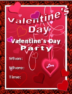
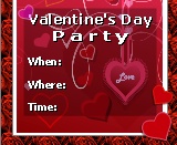
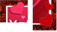
The completed poster
Posters, flyers, signs and other one illustrated documents can easily be made entirely in Writer. Although the focus in this tutorial will be on creating the poster entirely with Writer, Draw has a number of special effects tool that aren't available in Writer that can be used to create some great custom graphic objects that can be incorporated into a Writer document like a poster. Both the Draw and Impress section of this website contain tutorials on creating custom objects.
Although the project will be referred to as a poster its design is similar to that of a flyer, a placard, a sign, advertisement or any printed project that needs to be visually strong. Every poster needs a topic so for this example a Valentine's Day party theme will be used as the topic mainly because the colours scheme is limited (Valentine's Day colours) so the focus can be more on creating the different elements and how they are incorporated onto the page. The techniques in this tutorial can be adapted to any theme; birthday, anniversary, holiday theme, invitation, yard sale, graduation, basically any topic that needs a creative presentation.
The poster will be made up of these 5 elements:
- Background image - main design
- Text box - allows the text to be moved anywhere on the page (Frames can also be used, to view a tutorial on Frames see the 3 Panel Brochure page)
- Fontwork - creates the banner
- The Frame drawing shape - used to cover the edges of the page
- Miscellaneous Drawing shapes - adds to the design
Lots of detail is provided for certain topics that the user might not be familiar with such as Text boxes, the Crop tool and the Drawing Frame tool. The text box in particular, is given lots of attention as most users have never experienced this tool. However if you really don't want to get bogged down in learning all the properties of a Text box you can jump down to create a text box section. Once you know how to create a Text box all you really need to know is how to format the text in the Text box and that is basically the same as formatting text on a page.
Users already experienced with the five elements that will be used to create the poster can jump to the section Putting it Altogether. Writer users not experienced in creating graphic design projects like posters should probably read the whole tutorial as you will be working with Writer in a different way.
Page Setup
Paper Size
Don't think of a poster in the same way you think of a basic Writer document. A poster is a theme designed document that is meant to be seen at a distance so you need to think larger. If printing the poster from your desktop printer than your page size is limited by your desktop printer. However, you can setup a larger page than what your desktop printer can print if you take it elsewhere to get printed. For example if wish to create a 11 X 17" poster but your desktop printer can only print 81/2 X 11" you can still choose that larger paper size in the Page setup box and export the poster as a 11 X 17" PDF. Take the PDF file to the local business supply store, like Staples, to get printed (make sure to inquire on whether there is a charge for opening a file as many places charge a small fee for opening a file from a device like a Flash drive or CD/DVD disk).
The maximum size that a Writer document can be is 118.11 X 118.11", which means you can create a very large poster. A poster can be done in Portrait or Landscape orientation. Portrait view tends to be more visual (movie poster are usually done in portrait orientation) while Landscape mode produces more of a display sign connotation. Keep in mind that OpenOffice/LibreOffice programs are not known to be the most stable programs so sure to save often while working on the poster.
Margins
Margins aren't all that relevant to a poster as the whole page is filled with content. However, as a rule, the text shouldn't be too close to any of the edges (like a regular document), but should be placed more towards the middle. Since all the text will be placed in Text boxes (or Frames if you are familiar with them) the margins won't have much bearing on the poster as you won't be typing between them. A typical half inch margin all around should be fine.
Working with Objects
Selecting Objects
When smaller objects are placed on top of a larger object in Writer it sometimes it becomes difficult to select the smaller objects. If you click on a smaller object you may find that you often end up selecting the larger background object instead. Once the background object is selected it needs to be deselected before another object can be selected. This usually requires selecting the blank margin area of the page or hitting the Tab key to select the next object. There is no way around this awkward behaviour of Writer when dealing with a large background image.
Anchoring Objects
By default any drawing object, text box or image inserted onto a page is automatically Anchored to a specific paragraph. This ensures that when the paragraph moves the graphic moves with it. But in the case of the poster all the text is going to be in Text boxes and not typed directly on the page so there is no need to Anchor anything to a paragraph. As a result the default Anchor to a paragraph can actually make it difficult to position objects in the poster. To avoid positioning problems all objects will be Anchored to the Page. An object Anchored to the page stays where it is placed and can not be pushed out of position by other objects. Its important that the background image, for sure, be Anchored to the Page. An object's Anchor can be changed either through the Format menu of the Context menu:
- FORMAT -> ANCHOR -> TO PAGE
- Context menu -> ANCHOR -> TO PAGE
Locking Objects
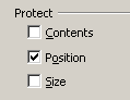 It's a good idea to "lock" the background image to the page so it can't be moved. That way you can adjust the foreground objects without worrying about moving the background. All objects can be locked. Writer refers to this as Protecting an object. For images the Protect option is found in the Picture dialogue box: PICTURE -> OPTIONS -> PROTECT. For Text boxes it is found under the Position and Size dialogue box: FORMAT -> OBJECT -> POSITION AND SIZE -> PROTECT or through the Context menu: POSITION AND SIZE -> PROTECT.
There are three levels of Protection:
- Contents - Protects the contents of an object, basically refers to Frame content not Text box content. It also prevents an object from being deleted. This option is not found in the Text box.
- Position - Protects the exact position of an object on the page and does not allow it to be moved.
- Size - Protects the size of an image so that it can not be resized.
Objects like Images and Frames can have all three levels of Protection while Text boxes and Drawing shapes can only be protected for Position and Size.
Stacking Order
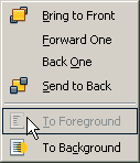
![]() All objects inserted on to the page exist on their own Stacking order or level. No two object share the same level, the first object placed is at the bottom of the stacking order and the most recent object inserted is at the top of the stacking order. Its important to be able to control the stacking order of objects because an element like the background image needs to be at the bottom of the stacking order so that the other objects can be stacked on top of it. You change the stacking order of objects through the Arrange command. A detailed look at the Arrange command can be found in the Draw section. The basic commands are; Bring to Front, Send to back, Forward One and Back One. To access the Arrange command:
All objects inserted on to the page exist on their own Stacking order or level. No two object share the same level, the first object placed is at the bottom of the stacking order and the most recent object inserted is at the top of the stacking order. Its important to be able to control the stacking order of objects because an element like the background image needs to be at the bottom of the stacking order so that the other objects can be stacked on top of it. You change the stacking order of objects through the Arrange command. A detailed look at the Arrange command can be found in the Draw section. The basic commands are; Bring to Front, Send to back, Forward One and Back One. To access the Arrange command:
- FORMAT -> ARRANGE
- Context menu -> ARRANGE
You can also use the Bring to Front and Send to Back buttons on the Standard toolbar.
Colour Scheme
Because a poster can be very colourful you want the colours to work together. Generally, a colour scheme will be defined by the background image as it is the largest object on the page. A simple colour scheme rule to follow is to use some of the colours found in the background image for the text and objects. This concept is particularly useful if you familiar with colour models.
Even though Writer's colour palette is very limited you should still be able to find some palette colours that are reasonably close to some of the background image colours. If not, you can always mix your own colours and add them to Writer's colour pallet. Creating custom colours based on colours in the image is a great way to limit your colour scheme and tie all elements together (see the Impress section on Drawing Shapes to learn about creating and adding colours to the pallet).
Poster Elements
The Banner
A large text banner is necessary to grab the viewer's attention. The banner can be created with the Fontwork tool, the Special Effects tools or by Constructing a Text Shape. Adding a realistic transparent shadow instead of a solid colour shadow will add a 3D effect to the banner by making it appear to be floating above the background image.
The Text Box
A text box is a container that holds text, it acts as an independent text object. It can be placed and moved anywhere on a page and is not restricted by any page constraints such as margins or text flow. Like a picture it has Page Wrapping options that allow the body text to flow around it and it can also be anchored to a paragraph so that it will move with that paragraph. You can not, however, insert an image into a text box like you can on a page. It contains two basic sets of properties; text properties and Text box properties.
Text Box Modes
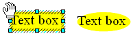
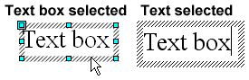 There are two modes to it; the box mode and the text mode. As shown here when the box is selected it displays the eight cyan Selection handles. In this mode the box can be moved, scaled, filled with colour and given a border. But when the typing cursor is in the box the handles disappear indicating that this is the typing mode. The text in the box can be formatted with most of the common formatting options such as font, font size, font colour, font attributes like Bold, line spacing, text kerning and text scaling. Tabs need to be entered through the Paragraph menu.
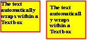
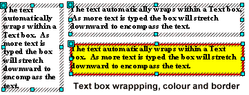 The Text box is a wrapping container for the text. Regardless of how wide the box is stretched the text lines always wrap to the width of the box. If the box is made very narrow then the text will be wrap downward. The box can be narrowed to a single letter width meaning that each letter will be on its own line.
Create a Text Box
To create a Text box:
 Select the Text tool on the Drawing toolbar
 The Text tool icon appears as a Cross-hair pointer
  Click where you wish to start the box but don't release the mouse button. The mouse button needs to be depressed the whole time that the box is drawn. If you just click on the page but don't keep the mouse button depressed the box will not be created. It is the drawing that creates the box.
 Release the mouse button when the box is drawn and the Typing cursor will be inserted into the box.
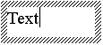 Type the text and the text will wrap within the box.
 Clicking the ESCAPE key once exits the text mode and selects the box. Clicking the ESCAPE key twice or clicking anywhere on the page deselects the Text box completely.
  To edit the text, place the pointer over the text and hit the ENTER key or double click to insert the Typing cursor back into in the box.
 The larger cyan Handle located at the top left corner is a Shape handle. The Shape handle icon replaces the Pointer when placed over it and dragging the handle reshapes the box. The box can be reshaped from a rectangle to an oval shape. The reshaped box will not be noticeable unless it has a fill and/or a border.
A Text box can be used as is with just its default option of Fit height to text without having to know much about its other properties. If you use a fill and/or border make sure to set the Spacing to borders to push the text away from the edges. However for users interested in more information on Text box properties, the information is provided below. Otherwise jump to the Text Formatting heading.
Text Box Properties
The Text box properties can only be accessed by the context menu: right click Context menu -> TEXT. There are two tabs; Text and Text Animation. (Note: the Text box default settings are generally sufficient for most users).
Text Tab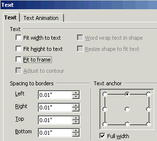
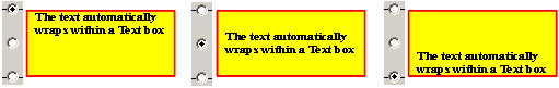
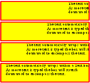
This tab contains option for how the text interacts with the Text box. The "greyed out" options are only available for Drawing shapes. By default the Fit height to text option is always checked. If it is unchecked as shown here the Fit to Frame option become available.
Each options is explained below:
- Fit width to text: this places the text on one line and stretches the box to to encompass that one line:
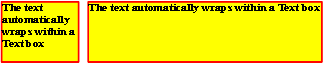
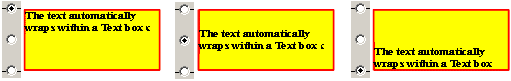
The text box on left is the original box and the box on the right has the Fit width to text option checked which stretches the box as wide as necessary to place the text on one line. This is meant for only a small amount of text, because if the text box contains a large paragraph the box will be stretch completely off the page. - Fit height to text: this the default option, it ensures that the text box can't be smaller that the text it contains:
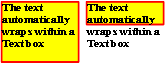
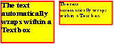
If the Fit height to text is not checked then the box can be dragged smaller that the text it contains as shown. With this option selected the box can be longer than the text it contains but not smaller. In other words the box will always encompass the text completely. - Fit to frame: with this option checked the text is forced to fit the frame. This means that the text will shrink with the box if the box is made small. The text can be forced to shrink to a point where it is no longer readable.
When this option is selected the Fit width to text and the Fit height to text option are "greyed out". - Spacing to Borders: adds space between the text and the box edges. This is a necessary option if the box contains a fill and/or a border as it keeps the text from the edges which makes the text easier to read.
Adding the border spacing increases the height of the box slightly to encompass the text and the spacing. - Text anchor: sets the horizontal/vertical position of the text within the box based on one of the Anchor points:
In this example the Centre Anchor points are shown; Top Centre, Middle Centre and Bottom Centre. This option is effected by the Full width option discussed below. In order to have the text horizontally centred in as shown here the Full width options needs to be deselected. If the Full width option is selected the text always aligns to the left edge of the box as shown below. Also if the paragraph alignments of Left, Center, Right and Justified are use they will align their position according to the Anchor points. In other words if you want the text to align to the right edge of the text box you need to set both the Align Right paragraph option and one of the Right Anchor points.  Full width: the Full width option only works with the three Centre Anchor points. If this option is checked all of the Centre Anchor points horizontally align their text to the left edge of the box rather that horizontally centering them.
The same settings as above but with Full width selected. As shown the text aligns to the left edge so it can expand to the full width of the box.
Text Animation
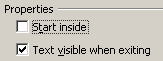 The Text Animation tab has animation options for scrolling the text in the box. For example text can scroll forward in the box like a marquee sign or it can scroll forward and then backward in the box. The animation is only useful if viewing the poster onscreen. Take note: if printing a poster with animated text, the scrolling text will not print unless the Text visible when existing option is selected. Also the text scrolling does put a demand on the computer so multiple scrolling Text boxes may end up scrolling slowly. Each animation type has its own options like continuous scrolling, speed of scrolling, etc.
In this illustration of the animation the Text box has a yellow fill with a red border to act as a marquee so the text can be seen moving to the left. As shown the text begins its scrolling from the right edge and scrolls towards the left edge. When the last bit of text scrolls past the left edge of the box the text will begin scrolling again from the right edge of the box. By default the scrolling is continuous but a specific number of repeats can be set in the options.
Text Formatting
The text is formatted the same way as it is on a page, meaning you have to select the text (not the box) in order to format the text. Most of the common formatting options are available such as font family, size, attributes, colour, font effects, paragraph alignments, tabs, line spacing, indenting and paragraph before and after spacing.
Fonts
![]()
Serif fonts become harder to read on a background, particularly at a distance.
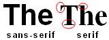 Because the poster will be using a background image it may be necessary to use wider, thicker Sans-serif fonts as they will be more readable against an image background than a Serif font. A Serif font, like Times New Roman has both wide and thin letter stems with "tick" marks that act as feet and shoulders to the letters that help make the text easy to read on a white background. But they are not so easy to read on a busy background. Remember that the poster is being read a distance so the letters need to stand out and be readable at a distance. A wider Sans-serif fonts like Arial Bold, Arial Black or Verdana Bold will prove to be more readable at a distance.
Text Scaling
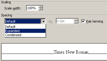 Several hidden text features that work well on a poster are the Text Scaling and Spacing options. These two features are found in the Character property box: FORMAT -> CHARACTER -> POSITION or Context menu -> CHARACTER -> POSITION. The Pair kerning option can be left checked as it won't make that much difference to the letter spacing.
In order to access the Character properties the text has to be selected not the box.
- Scaling: Scale width - This stretches or condenses the text width by percentages. Over 100% stretches the width, under 100% condenses the width:
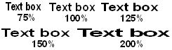
Note that only the width of the text is scaled not its height. The text's width can be scaled over 1000% but becomes almost unreadable at that width. - Spacing: Expanded - increases the spacing between each letter (by points). A little Expanded text can help make a heading stand out. However if the letter spacing is Expanded too much it can make the text more difficult to read.
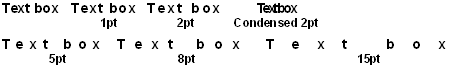
- Spacing: Condensed - decreases the spacing between each letter.
Text Shadow
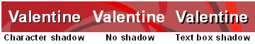 Its a good idea for text to have a shadow on when its placed over a background. This will help to delineate the letters shapes. The shadow can be part of the text as in a Character shadow or it can be applied to the Text box (when a text box has no fill the shadow is applied to the text).
![]() To apply a Character shadow choose either:
To apply a Character shadow choose either:
FORMAT -> CHARACTER -> FONT EFECTS -> SHADOW, or right click for the Context menu -> CHARACTER > FONT EFECTS -> SHADOW.
![]()
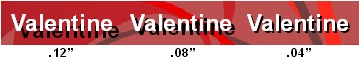 A Text box shadow is applied in the the same way as a Drawing shape's shadow:
FORMAT -> AREA -> SHADOW or right click on the box outline and from the Context menu -> AREA -> SHADOW. The shadows's Distance may need to be reduced to bring the shadow closer to the text. A solid shadow set too far from the text actually makes the text harder to read.
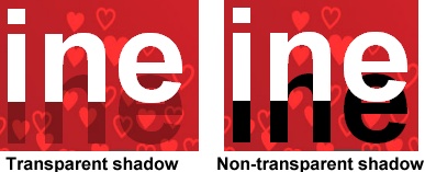 To make text appear like its floating above the page set a higher Distance and a high transparency so that the background image can show through the shadow which creates a realistic shadow effect. For best results set the shadow Colour to Black and raise the transparency between 60-70%. The greater the shadow Distance the higher the object appears to float over the page. If you use a Character shadow and a Text box shadow together the text box shadow will have a hard, dark edge around the shadow.
Fill and Border
 A Text box can contain a fill and a border. Generally the Text boxes are left with their default transparent but there are times when they may need be filled to make the text more readable. A background image may have a very colourful and busy design meaning that no matter what colour of text is used some of the text become unreadable. In this case adding some colour to the box can help make the text more readable over a background image. You still want to see the background image through the Text box so start with at least a 50% transparency. The text will also need to be moved away from the Text box edges so the Spacing to Borders option is necessary. Add spacing to all sides of the box. Depending on the size of text a .2" spacing for all sides is a good start.
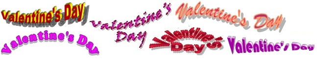
Fontwork
Most users have some experience creating Fontwork objects. A detailed tutorial on the Fontwork Circle shapes can be found in the Fontwork section of the Draw tutorials. For our example Fontwork will be used to create a banner that reads "Valentine's Day".
 There are only a handful of Fontwork proprieties to modify; Fontwork Shape, font, colour, line and shadow, but each of these properties provide many options and when combined with the 3D Extrude command the variations are almost endless.
 In this example the Fill and Line Styles are the same colour to demonstrate how the different Lines styles effect the letter shapes creating interesting effects.
Don't forget to experiment with the Line styles as this property is often overlooked and different Line styles can add a unique appearance to the shape. Don't make the Line width too large or it may make the letters difficult to read. Keep in mind that a 3D Extruded Fontwork object loses all its line properties.
A nice touch will be to change the Fontwork's default shadow to Black and set its transparency between 60-70%. This will create a realistic transparent drop shadow.
Don't sacrifice design over readability, the Fontwork banner's job is be noticed which means it can only catch a passerby's attention if its very readable.
Background Image
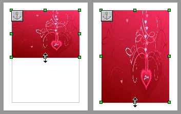 When using a background image for the poster you will probably find that the image is not created in the same aspect ratio as the page. In other words the page is in Portrait format which is taller that it is wider and the image, most likely, will be in Landscape format which is wider that it is taller. The problem comes in trying to fit a Landscape shape into a Portrait shape.
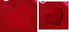
As shown in this illustration you can not just stretch a landscape shaped image down to fit in a portrait shaped page without severely distorting the image. The easy solution is to change the Landscape image's width to height ratio to that of the Portrait shape's width to height ratio and then stretch the image. You can easily change an image's width to height ratio with the Crop tool.
Crop Tool
The Crop tool is used to exclude or hide parts of an image. Any or all sides of an image can be cropped. In essence you are changing the image's width to height ratio. The cropped out parts are not permanently removed and can be restored. The Crop tool is part of the Picture dialogue box, to access the Crop tool Double click on the image to open Picture dialogue box PICTURE -> CROP or use the Context menu -> PICTURE -> CROP.
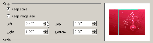 Using the Crop tool is fairly straightforward, you use the spin dial to spin UP to crop an image. Spinning UP creates a positive number and moves the Crop box away from a picture's edge into the image. (Spinning DOWN creates a negative Crop which means the Crop box will move away from the picture). As with all Spin boxes you can also type a value into the box. The hidden part of the image will be anything that is outside the Crop box area. Remember that the point of this is to change the image's width to height ratio from Landscape to Portrait. Therefore it becomes obvious that only a part of the image can be used. So a decision needs to be made as to which part of the image will be used.
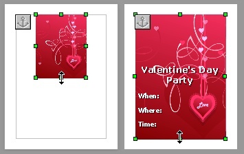 As shown here the image has been modified into a Portrait shape and then stretched to fit the Text Boundary box of the page yielding little or no distortion of the image. However, depending on where you place the Text box on the page, you don't necessarily want to crop the picture so its main design is in the middle of the picture. Sometimes off-centring the main design of the picture can work better. Because there is always a readability issue when placing text over a busy image, if the main design of the picture is cropped more to one side, as shown here, then less text will intrude over the design.
For most images it is not necessary to try and calculate the exact measurement needed to create the Portrait ratio. If the Crop box width to height ratio in the Preview Window closely matches the Portrait ratio of the page or the Text Boundary box (depending on whether you are filling the page or the Text Boundary box with the image) that should be good enough for most images.
Cropping for a Precise Width to Height Ratio
Certain images may require a more precise width to height crop ratio. For example if a person's face is to be used as a background image this will require a more accurate width to height crop ratio or the picture will be distorted when stretched to fill the page or the Text Boundary box.
The width of an 81/2 X 11" page is 77% of the height (8.5/11=77%). Therefore the image's width needs to be cropped to 77% of the image's height to scale perfectly on the whole page. For a picture that is 5" tall the simple calculation is: 5 x .77 =3.85. This means the image width needs to be cropped to 3.85". When the image is stretched to fit the page it will fit the page perfectly without any distortion.
If you're placing the picture over the text Boundary box (recommended rather than the page) then the ratio will vary depending on the margin settings. If using 1" margins all around, then the text Boundary box is 6.5 X 9" resulting in 6.5 / 9 = 72% ratio. If the image being used is 5" tall; 5 X .72 = 3.6". A 5" tall image needs its width to be cropped to 3.6" to fit perfectly without distortion into the Text Boundary box.
You will need to type the values in the Crop spin boxes for small adjustments as the spin arrows jump a set .48" per spin.
The Frame Tool
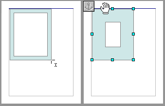
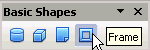 The Frame tool is part of the Basic Shapes drawing tools. It is the last item on that menu. As the name implies its a rectangle that has an open centre. It contains a Shape handle so that the opening can be made bigger or smaller. Using this tool follows the same procedure as the Text box or any of the other Drawing tools:
-
 Click once on the tool to turn it on (don't drag the tool onto the page, just click it). Once on the page the pointer will change to the Cross Drawing drawing icon
  Position the Cross Hairs icon on the page where you want to start the Frame.
- Click but keep the button mouse down while drawing the Frame. If you just click on the page with the Frame tool nothing will happen.
- Release the mouse button when the Frame is the size you want. It actually doesn't matter how large you draw the Frame because it can be stretched any size.
- Click the ESCAPE key to turn the Frame tool off. Like all the Drawing tools the Frame tool stay turned on and if you try stretching the Frame while the tool is still active you may accidentally start drawing more Frames.
- Stretch the frame as necessary to cover the area.
- Use the Shape handle to adjust the Frame opening larger or smaller.
- Fill and border the Frame as you would any other Drawing object.
Before selecting any Drawing tool hit the ESCAPE key to ensure nothing is selected on the page. Writer doesn't allow you to draw on top of any other Drawing object or Text box if it is still selected.
Putting it Altogether
It doesn't matter which elements you begin with:
- Background image, Fontwork, Text box
- Fontwork, Text box, background image
The advantage of placing the background image first is that it sets the colour scheme and layout for the design. The disadvantage is that irritating Writer problem of constantly selecting the background image when trying to select the smaller objects. Even with the background image Protected it can still be selected. Leaving the background image to the last will alleviate the selecting problem and makes placing objects on the page easier. But without the visible background to act as a the layout guide, it may be necessary to shift all the elements around after on the background image is placed.
The following illustration demonstrates one method for putting all the elements together:
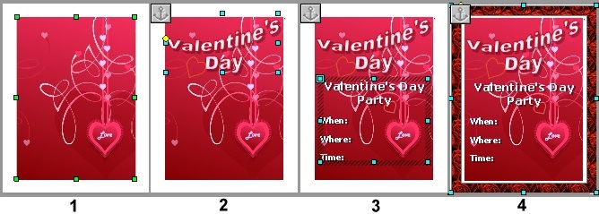
- Background image inserted onto page
- Image is Cropped
- Stretched to fit the page
- Position is Protected
- Anchored to Page
- Fontwork banner added
- Fill and border colours match colour scheme
- Shadow made black with a 60% Transparency
- Anchored to Page
- Text box added
- Font, font size and font colour chosen for maximum readable
- Black shadow added with a 60% Transparency but with the shadow Distance set low
- Drawing Frame added
- Sized to fit the page.
- Frame opening set to leave a small edge of the page to act a a border
- The Roses Bitmap fill is used as the fill but any type of Solid colour or Gradient colour fill that matches the colour scheme could have used
At this point the poster is complete and could be considered finished. But you can still take it one step further. The poster contains large elements so it can be seen at a distance but people will also walk up to it and take a closer look. So now you add some close-up elements to help finish the design.
Close-up Elements
The completed poster
An easy way to catch someone's attention is to make elements appear 3D, therefore some 3D illusion is added through different methods. An obvious one would have been to use the Extrusion tool on the Drawing toolbar to turn the Fontwork object into 3D. In this example other simulated 3D methods were used.
 Since the Drawing tool set already includes a Heart shape drawing tool, it makes sense to incorporate some drawing Hearts to tie the theme closer together. The Heart Shape drawing tool is found under Symbols Shapes category. The Heart shape also contain a Shape handle that modifies the heart shape from wide rounded curves to narrow rounded curves. The Extrusion tool could also have been used to turn the heart shapes into 3D heart shapes.
Some of the added/modified elements include:
- The Fontwork banner is moved to the Front of the Page (Arrange command) and stretched to overlap the Frame. This creates a 3D effect of the banner popping out of the Frame. This why its important that all the shadows be made black with a high transparency. Where the shadow overlaps the background, the background shows through the shadow creating a realistic 3D illusion.

- The Heart Drawing shape is used to create different typed of hearts:
- Several Heart shapes containing transparent shadows overlap the background image and the Frame helping to create a clear foreground and background effect. Again transparent shadows are important.
- Several Heart shapes contain just a border with no fill and are placed in empty spots to help emphasize the Valentine's Day theme. The borders are made transparent so they blend better into the background. To make a border transparent: FORMAT -> OBJECT -> LINE -> TRANSPARENCY or Context menu -> LINE -> TRANSPARENCY.
- Several Heart shapes containing a transparent fill and are placed over empty spots. The transparent fill help make the hearts blend into the background. Adding a transparent drop shadow to some of the hearts allows the drop shadow to show through the heart shape. This makes the Heart shape appear to pop out.
- Several Heart shapes containing a transparent fill and border are placed over some of the text to add the illusion of an overlap which helps to create a 3D effect. Adding a transparent drop shadow to some of the hearts allows the drop shadow to show through the heart shape. This makes the Heart shape appear to pop out even more. Note: making an object's fill transparent doesn't effect its border, the border's transparency is effected by the Line properties mentioned above.
- Since the word "Party" is on its own line some Expanded spacing and Width scaling was added to make that word very pronounced.

- Several Heart shapes containing transparent shadows overlap the background image and the Frame helping to create a clear foreground and background effect. Again transparent shadows are important.
When adding extra elements to the poster make sure to keep the effects consistent. For example, all Drop Shadows should be of the same colour, same transparency and should be facing the same way. When adding a transparent shadow to an object that already has a transparent fill, the shadow will show through the fill and sometimes this effect works well and sometime it doesn't.
Printing the Poster
The poster contains a lot of transparent shadows and sometimes Writer doesn't translate the transparent shadows very well when it sends the document to your desktop printer. As always its a good idea to test out some of the transparencies before the poster is finished. If the transparencies, or the document itself, doesn't print the way it looks on screen you can always try exporting it as a PDF. Generally a PDF file handles transparencies better than the original program. If the PDF file displays all the transparencies intact then its very likely to print properly. But no file format is perfect so a PDF file should be generated and printed early in the design process to see if there are any problems with printing the transparencies.
Comments or suggestions: lincpark@hotmail.com.